
To whom it may concern,
I speak cautiously as I represent roughly 80 million Americans born between the 1980s and the early aughts, but yes, I am a millennial. Listen, I understand if you can’t really keep up with our blazing fast lifestyle, our innate urge to publicly document every fleeting moment, our overindulged sense of entitlement or our steadfast yearning for acceptance and attention. It’s cool—don’t sweat it. We like to live life in the fast lane. We “go hard in the paint.” #YOLO! (You only live once, duh.)
I’m kidding. Well, kind of.
As I take my bow for such a convincing performance of a generation gone awry, I also slowly sink my face into my palm. It is difficult, sometimes, to be so closely associated with a demographic that partially believes Mick Jagger is just some dude who has great “moves” in a Maroon 5 song. I quite frequently wonder what the long-term side effects of my generation will be, especially in the realm of design.
Design is a delicate practice that is directly influenced by those who use it; therefore, design is finicky. And unfortunately, so are millennials. This generation takes pride in being different and unique. This means that design must be organic in order to really grab hold of the momentary attention span of this audience. Although mostly annoying, this actually could bode well for creativity moving forward.
Millennials generally see through traditional gimmicks in creative messaging, sifting though the nonsensical bells and whistles and focusing mainly on the content. In a world where “Googling” provides instantaneous fact-checking, content and delivery must somehow project authenticity. Ah, the method of delivery—that is where design enters the fray.
Flat. Period.
Flat design is all the rage nowadays. Well, what exactly is flat design? To be “flat” is to approach user interface in the most simplistic way possible. It is the use of solid colors, hard corners, minimalistic iconography and interpretive usability.
It is also a direct response to the recent design trends of skeuomorphism. Kelsey Campbell-Dollaghan of Gizmodo explains skeuomorphism as a medium that “boils down to visual trickery, or the use of details and ornamentation to make one thing look like another. In architecture, false facades are skeuomorphic. In car design, fake wood paneling is. Skeuomorphism in UI design usually refers to a digital element designed to look like something from the physical world.”
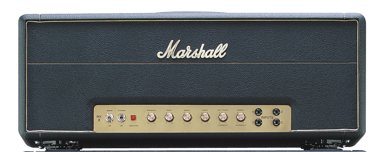
Flat design is the antithesis of all those things. It is what millennials crave—a simplified avenue for what is most important: the message. Why does the notepad icon have college-ruled lining? All I care about are the words being written. Why does the volume slider need to look like it belongs on a vintage Marshall Super Lead Model 1959 Plexi amplifier? All I care about is how loud it is…duh.
Needless to say, content has become king once again. Adrian Taylor of Smashing Magazine emphasizes this, in which “media consumption, whether of text, audio or video, is probably the activity we engage in most on our devices, and for that use case, we just want the interface to get out of the way.” Millennials are driven by the outcome, not the ride. Flat design gives them what they want, when they want it. (Which is almost always “now.”)
Get to the point. Yesterday.
Did I mention how short the attention span of a millennial is, yet? Let’s face it, we have to abbrieve ev (translation: abbreviate everything). While flat design aides in communicating the message effectively in a minimal amount of time, it is not enough to appease the appetite of a content-hungry millennial who is exposed to multitudes of information within a given minute.
This generation feeds on the most up-to-date, accurate “news” regarding anything and everything. This sounds like a job for… SOCIAL MEDIA! I use the term “news” very loosely in reference to social media; however, although “social” by nature, this form of media can (if used correctly) provide a wealth of information to audiences of all shapes and sizes.
The advent of this medium has found its way into design as well—more specifically, web design. More and more, websites are including various feeds for continuous information. Even Twitter, Google and Facebook have applications for websites to display this type of content—these applications are called APIs. Poynter.org describes an API, or application programming interface, as a web functionality that enables software programs to communicate with one another.
This means that millennials expect a piece of each website to be carved out solely for continuous information, whether it be for RSS feeds, social media, etc.
One such example comes from an industry not necessarily instantly associated with the high-tech world, a fly-fishing manufacturing company—Temple Fork Outfitters. At TFORods.com, a site developed by bloomfield knoble (bk), users are exposed to a different kind of “news feed.” It is one that’s not only visually appealing but relevant to the content of the site as well. In order to bridge this gap (aesthetics v. relevance) and give fly-fishers something beautiful to look at while also being exposed to exciting adventures of fellow anglers, bk chose to implement the functionality brought forth by Tint (a social media interface aptly created by millennials). Tint provides a unique approach to continuous content layout, specifically for social media.
For TFORods.com, this functionality displays recent tweets and Facebook posts in a grid, complete with pictures as well as content. Users are able to quickly scroll through visual representations of relevant matters happening in the world of fishing, allowing for the “big fish” tales to materialize and fulfill their preconceived embellishments.
———
Whether instrumental or detrimental (thanks, Bieber) to the ever-evolving concept of design, millennials will leave their mark.
Who knows how long it will last, though, as the next generation may completely reverse the entire movement. I can’t say that I agree or disagree with the direction my craft is heading; all I can do is buckle my seatbelt and enjoy the ride. Regardless, one message is clear: the generation in control of the way things look and the way things work is always the next generation.
Right now, that seems to be in the hands of the millennials. In my hot and humble opinion: so-far-so-good. I enjoy a good shake-up of the status quo. I’m eagerly awaiting the further development of concepts like flat design and continuous information integration, but I also wonder what great things the next generation of designers will bring.
True to form, a millennial can only hope for better. In the meantime, on behalf of my fellow millennials, I apologize for all of the cat videos.
#YOLO,
Andy
Related articles


Andy Edwards is Director of Digital Services at bloomfield knoble. He possesses the hybrid skills of a strategic business executive and a creative, problem-solving designer; someone who is a catalyst for transformation and the agent of cultural change.