This content has been archived. It may no longer be relevant
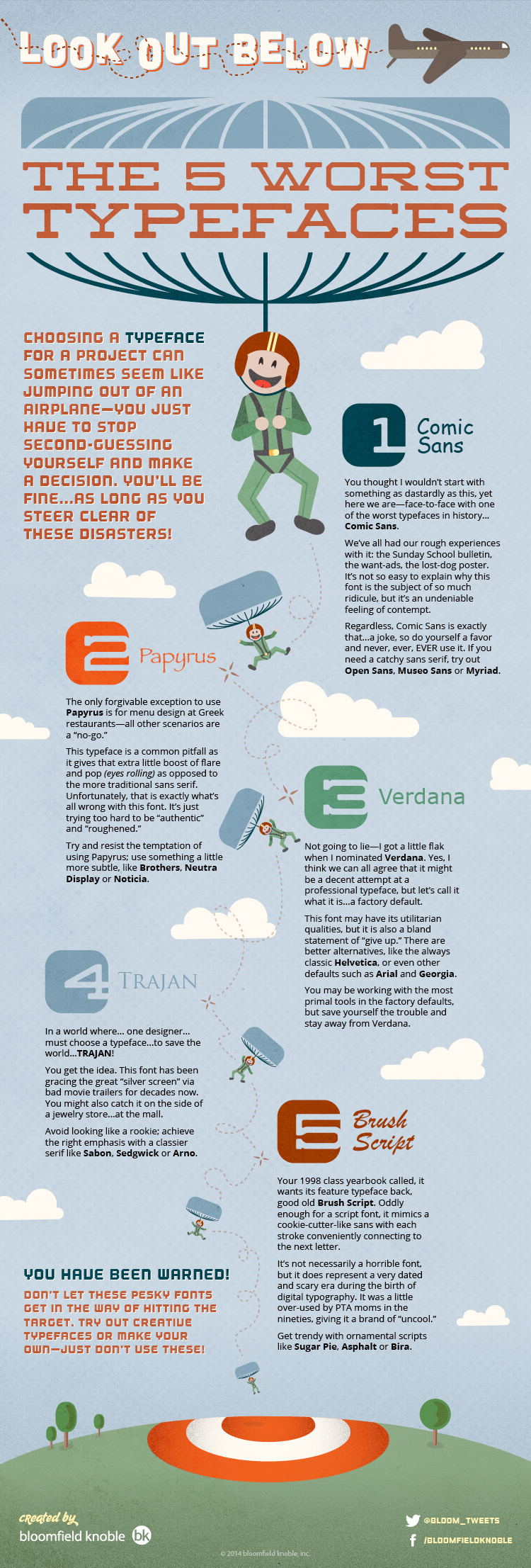
Choosing a typeface for any project can sometimes prove to be a cumbersome task. Not only do you have to identify the type of typeface (e.g. serif, sans serif, script, display, slab serif—the list goes on and on), but you also have to make sure you don’t pick a dud! A poorly chosen typeface can really sandbag your creative efforts. It’s almost as important to know the bad typefaces as it is to know which ones are great. Truthfully, the design world is almost over-saturated with thousands of different typeface choices, but luckily, a vast majority of designers actually agree on the worst typefaces to use. Below is a short list of what we think are the ones you should avoid.
Associate Creative Director at bloomfield knoble