This content has been archived. It may no longer be relevant
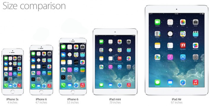
For the past few years the growing trend in “phablets” has had a noticeable effect on web design. Although phablets have only accounted for 2% of all smartphones shipped globally, this still amounted to around 20 million devices. Additionally that number is set to jump to 10% within the next 18 months with the help of the new iPhone 6 Plus.
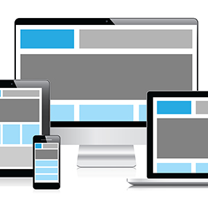
So what does this mean for designers? Strictly speaking this means that the push to responsive versus adaptive design is more important than ever. While adaptive design does have its place, new websites built from the ground up should be designed as responsive as changing site structure at a later date will be more difficult.
While some designers may think that the introduction of the phablet just means adding another break point in your media queries, the truth is much deeper. With screen sizes ranging anywhere between 5 – 7 inches, designers have yet another platform to consider when deciding what content the user wants readily available at this new screen size.
Phablets fit really well into current design trends. With more people seeking open minimalist designs, the phablet can let your design breath and not feel as constricted as the smaller smart phones we are used to designing for.
Related articles


Associate Creative Director at bloomfield knoble